DOH TAK KEH:
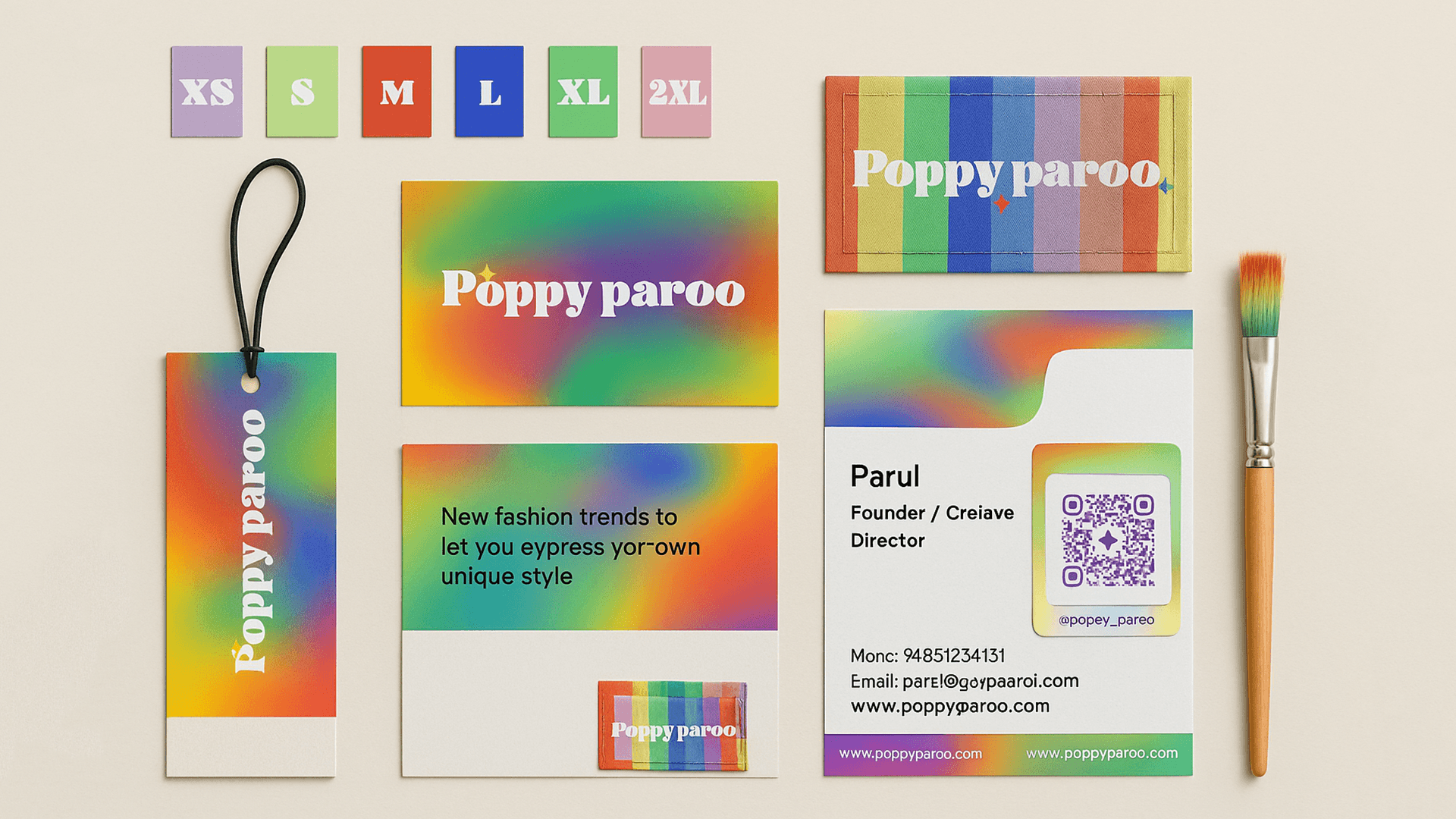
Branding and Packaging
A strategic rebrand designed to give Doh Tak Keh a bolder, clearer, and more cohesive visual voice.
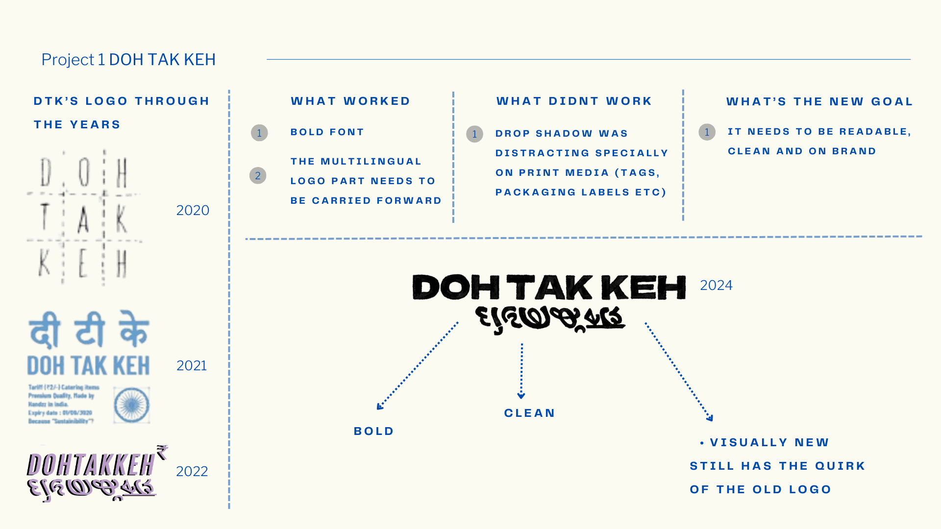
Over the last two years, the founder felt a growing need to rebrand, as the existing 2022 logo and identity began to limit Doh Tak Keh’s evolving vision. With the Spring–Summer ’24 collection marking a shift in the brand’s design language, it became the right moment to build a refreshed identity, one that felt stronger, more legible, and future-ready.
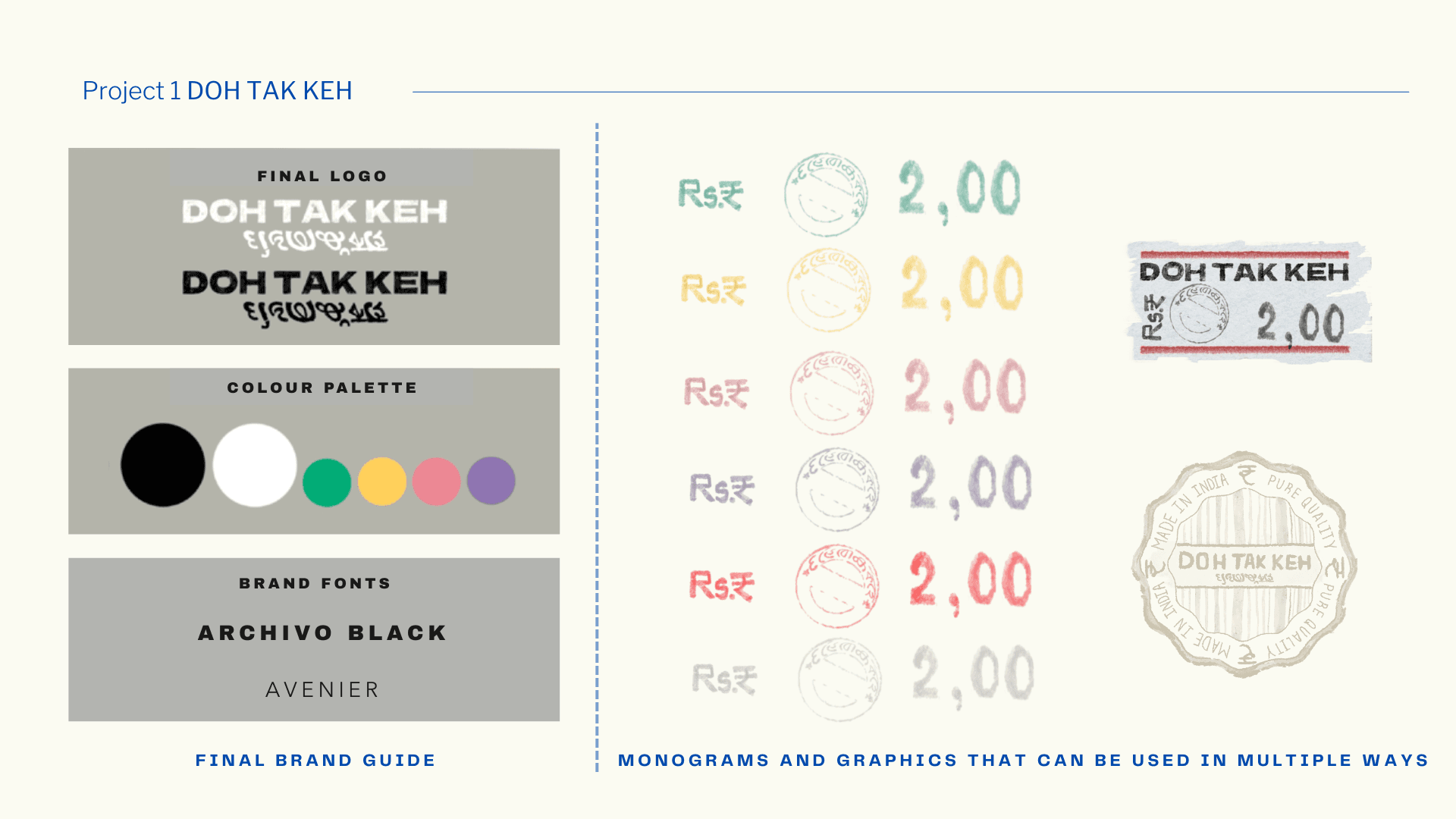
The goal was to create a visual system that fully supports the brand’s loud, colourful, and graphic personality rather than competing with it. The new identity reflects this balance: bold yet refined, expressive yet cohesive, and deeply aligned with the brand’s artistic spirit.